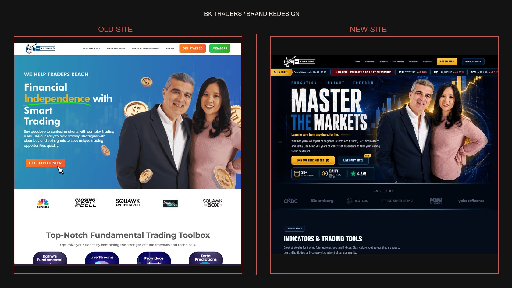
BK Traders had a strong foundation, but its previous site presented the brand as a fairly static, multi-color trading resource. Working together, we reshaped the identity into a more confident visual system: deep navy and black foundations, electric blue structure, gold energy, and a tighter editorial voice built around education, insight, and freedom.
The work extended beyond a new look. We helped define the art direction for the new hero world, the sharper BK Traders mark and presentation, the daily intel ticker, live-stream emphasis, education and tools sections, sponsor-ready moments, and the way Boris and Kathy's expertise shows up across the experience. The result is a brand system that can move from the website into daily content, live programming, and future campaign work without losing its point of view.
Visit bktraders.com