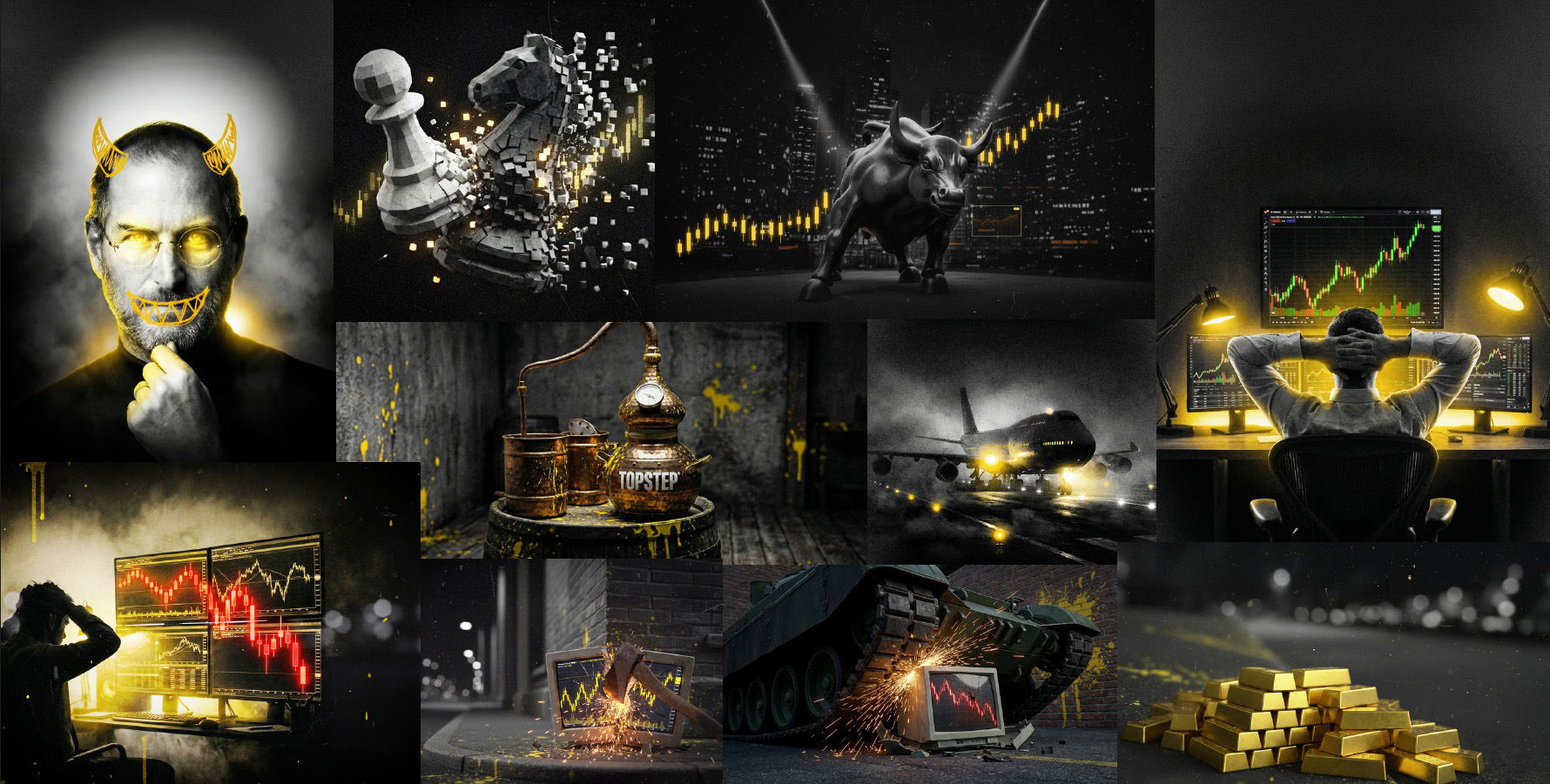
A major part of the work was building a repeatable AI-assisted editorial image pipeline. Four to five new images needed to be produced each week, connected to the subjects and stories in that week's articles. The visual system kept the work cohesive across wildly different ideas: trading psychology, market pressure, strategy, travel, risk, and ambition, all expressed through a consistent black, white, and yellow world. The system later extended into live-show materials, which will be explored in the related event work.
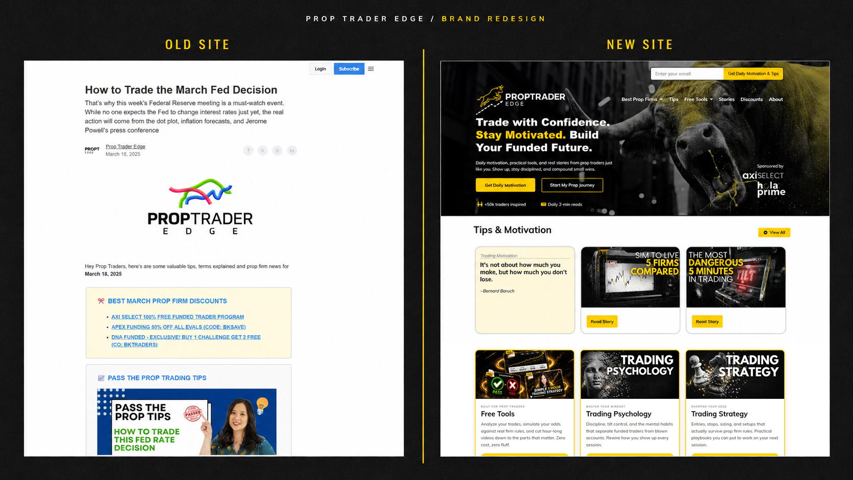
Prop Trader Edge was a nascent brand ready for a stronger point of view. Kohrtoons Studio reignited it under a new logo and a gritty, streetwise identity inspired by old rock-and-roll silkscreen posters: heavy black-and-white artwork, a focused color system, and a visual language designed to feel both retro and fresh.
The redesign positioned Prop Trader Edge as more than a finance brand. It became a sponsorship-ready editorial platform offering traders daily tips, practical tools, motivation, and real stories. A daily tip at the top of the experience created a consistent reason to return, while repeated access points invited visitors to join the daily newsletter. Sponsorship opportunities were woven into the broader system alongside social content, website features, and launch campaigns.
This sponsored piece combined footage captured at live shows with motion-graphic design created using Veo 3 and NanoBanana 2. The edit intercuts that original material with content supplied by the vendor and a hosted video segment from the on-screen talent, bringing the sponsor message into the same visual world as the broader brand.